
Clean
& Bliss.
Turning everyday cleaning into a bright, reassuring brand experience people can recognise at a glance.

Make cleanliness feel joyful and dependable.
Clean & Bliss needed a distinctive presence for a category often crowded with clinical claims and familiar visual conventions. The brand had to communicate effectiveness immediately while feeling warmer and more memorable in the home.
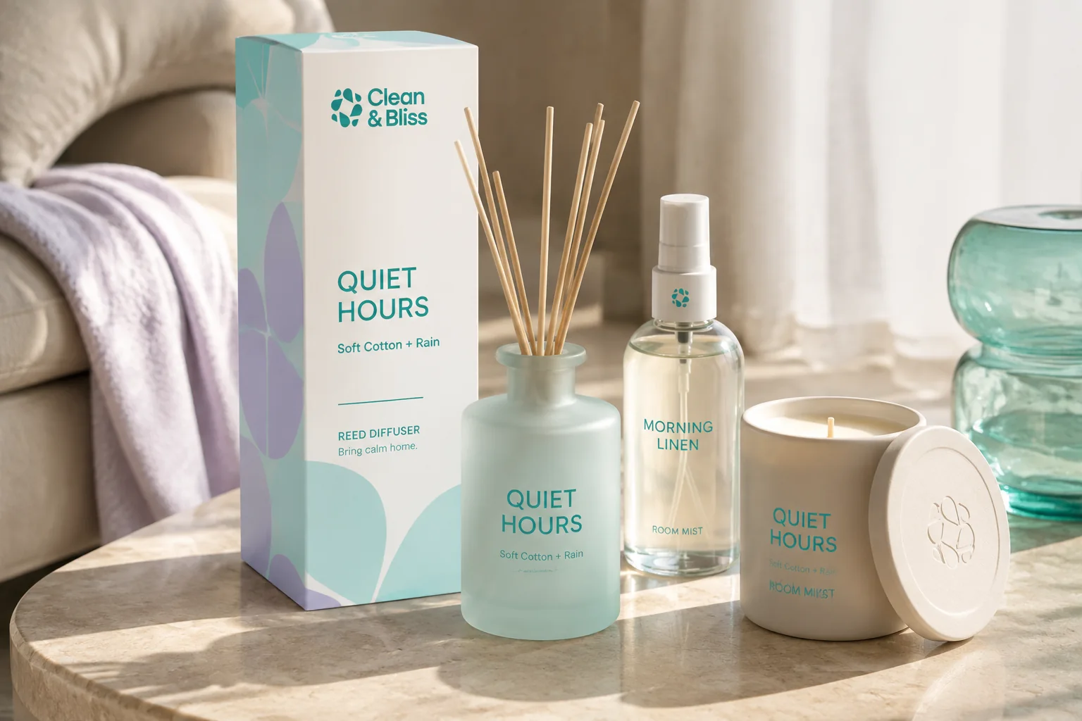
Build recognition through a simple, lively signal.
A bold logomark, bright colour and confident typography create a system that feels fresh without becoming generic. The identity is deliberately direct, helping Clean & Bliss remain clear across different formats, products and moments of use.
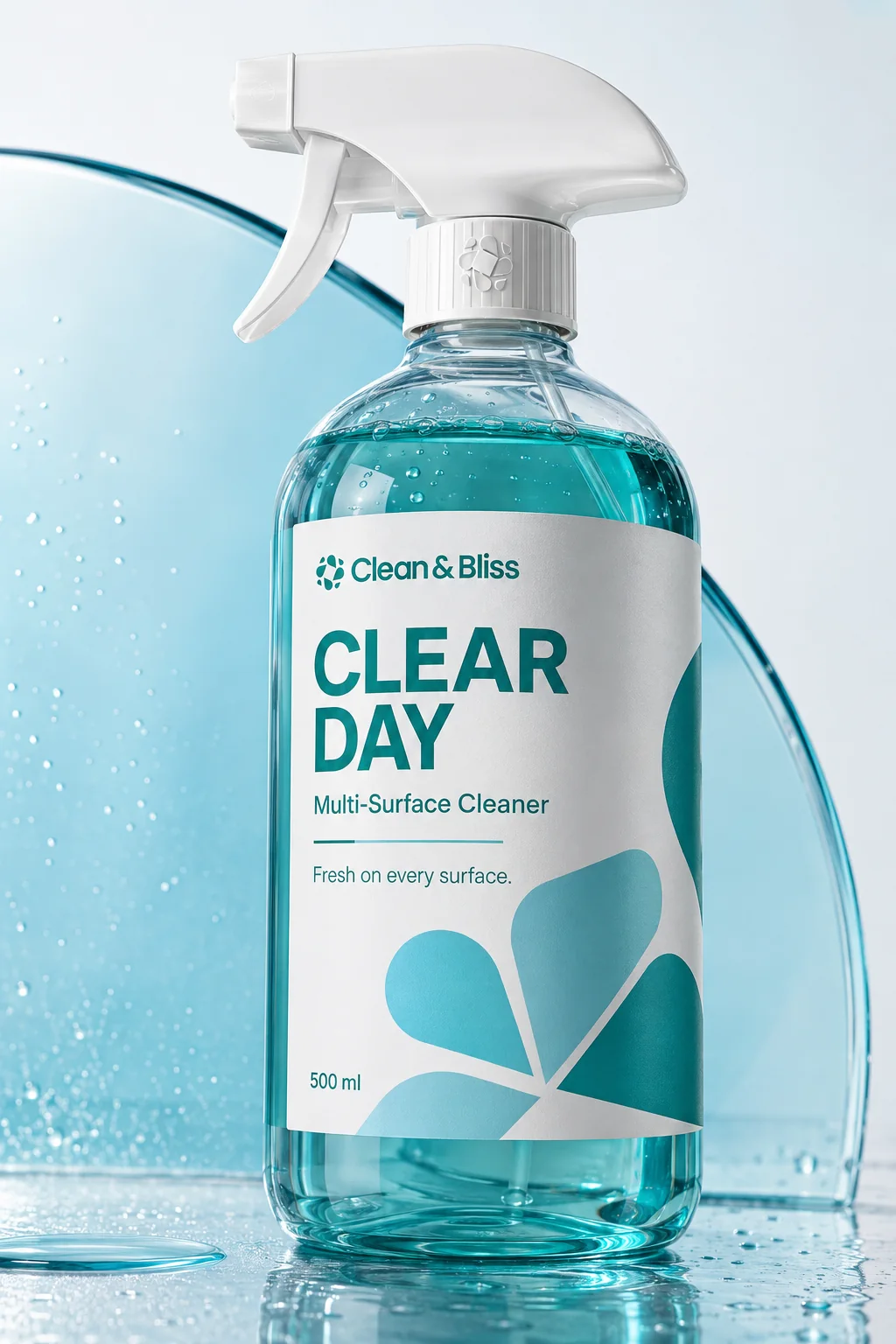


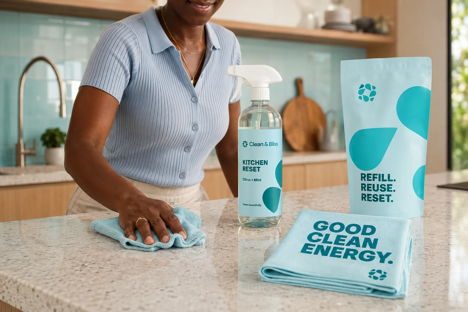

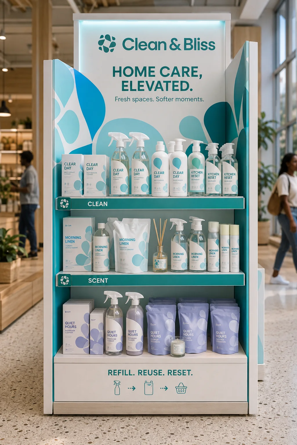

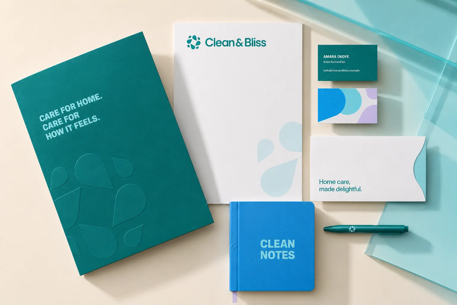
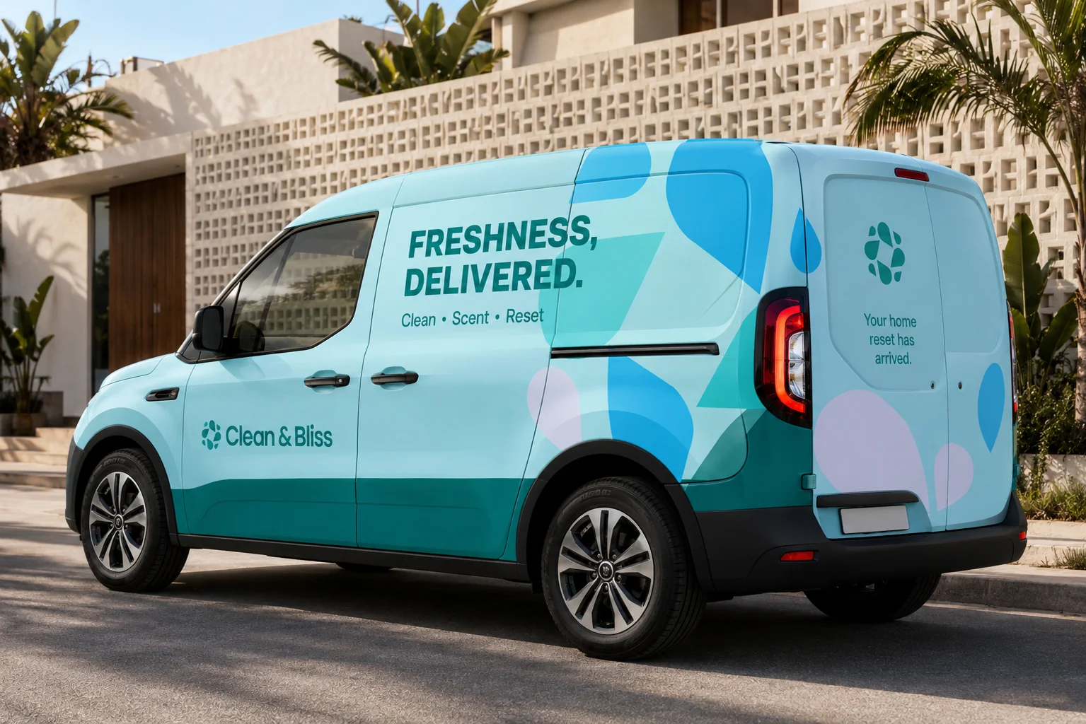
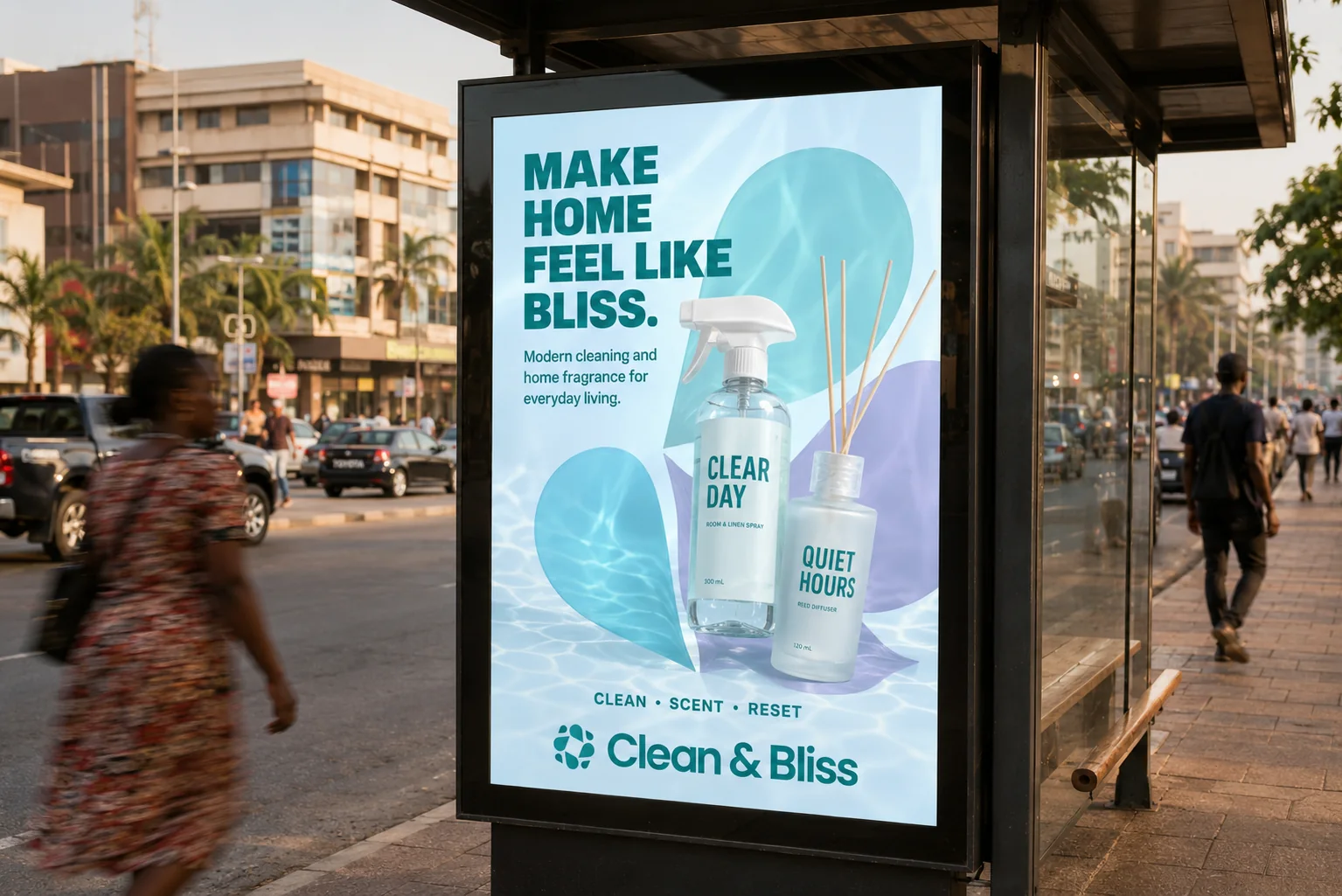
One optimistic identity across every touchpoint.
The system combines an ownable mark, crisp type and flexible colour fields to hold the brand together. Each application can change pace while maintaining a clear Clean & Bliss signature.
A memorable identity for brighter everyday care.
The finished direction gives Clean & Bliss a coherent and expressive foundation across packaging and communication. The system is designed to preserve recognition as the product range and audience grow.
- A distinctive signal for a crowded category
- Consistent expression across formats
- A flexible foundation for range expansion