
Beauty
& Care.
Giving accessible luxury a warmer, more trustworthy expression for the African beauty market.

Premium without feeling distant.
Beauty & Care wanted to become a trusted destination for authentic cosmetics and personal care across Africa. Its identity needed to signal sophistication while preserving the warmth and accessibility at the heart of the retail experience.
Let nature carry the luxury.
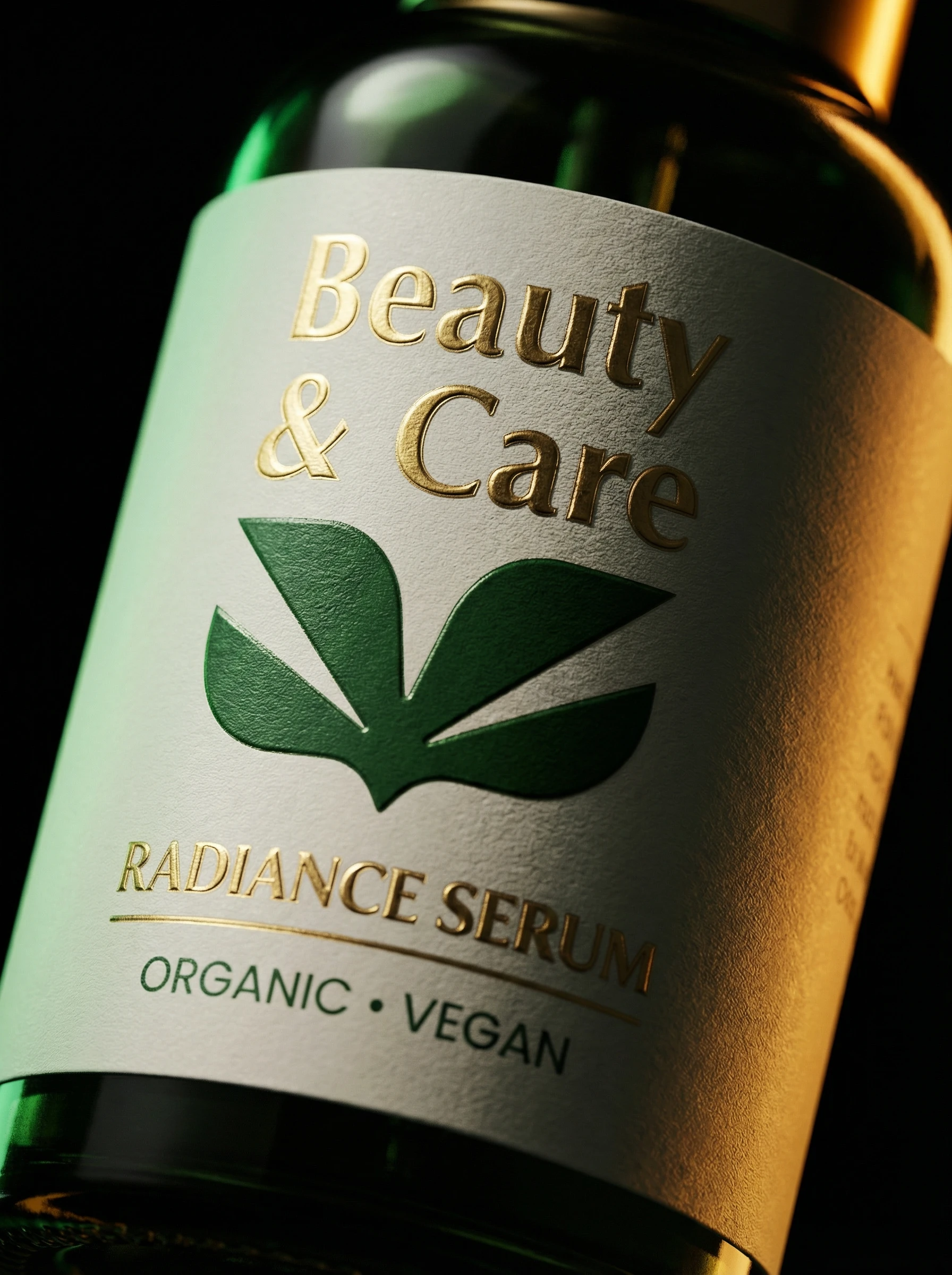
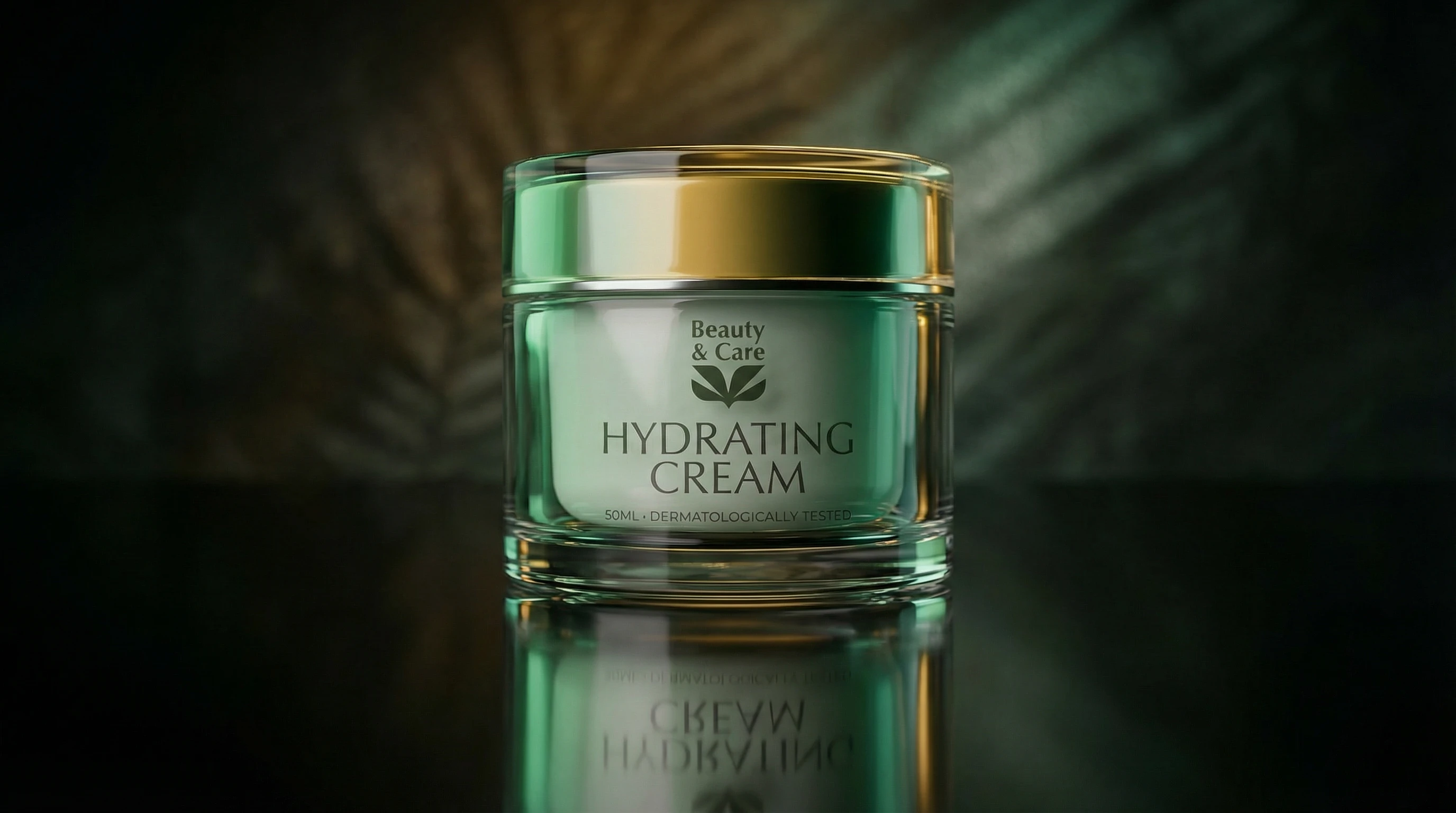
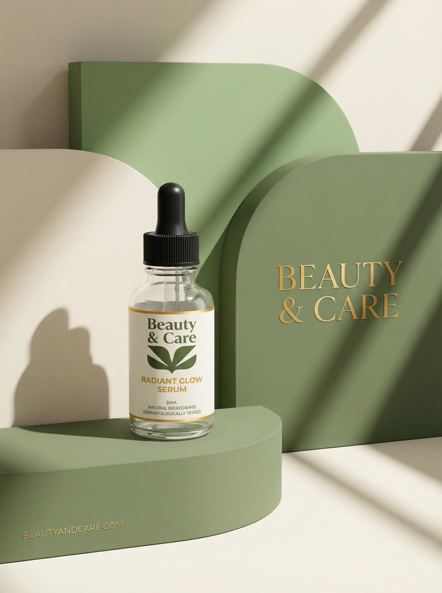
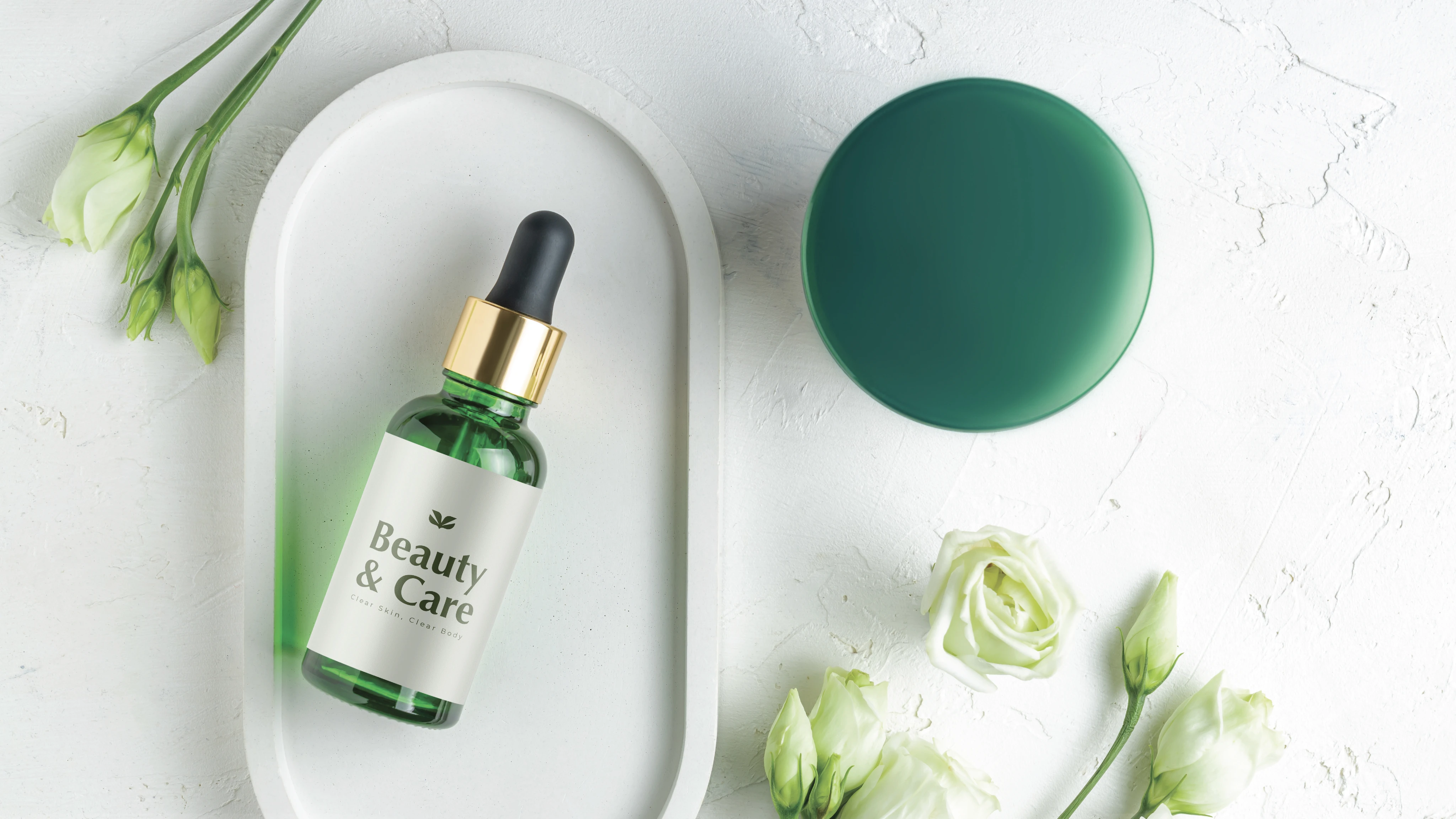
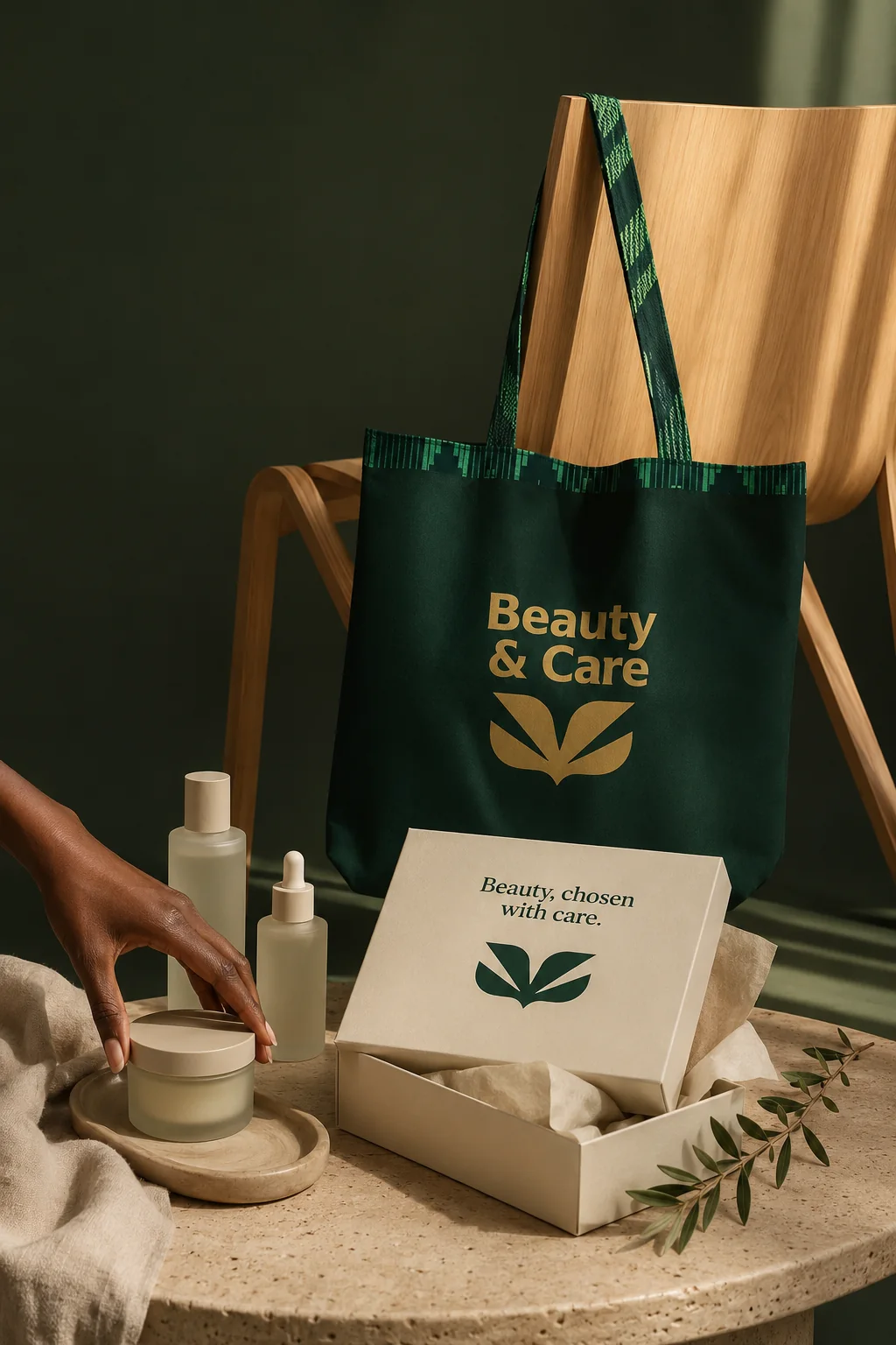
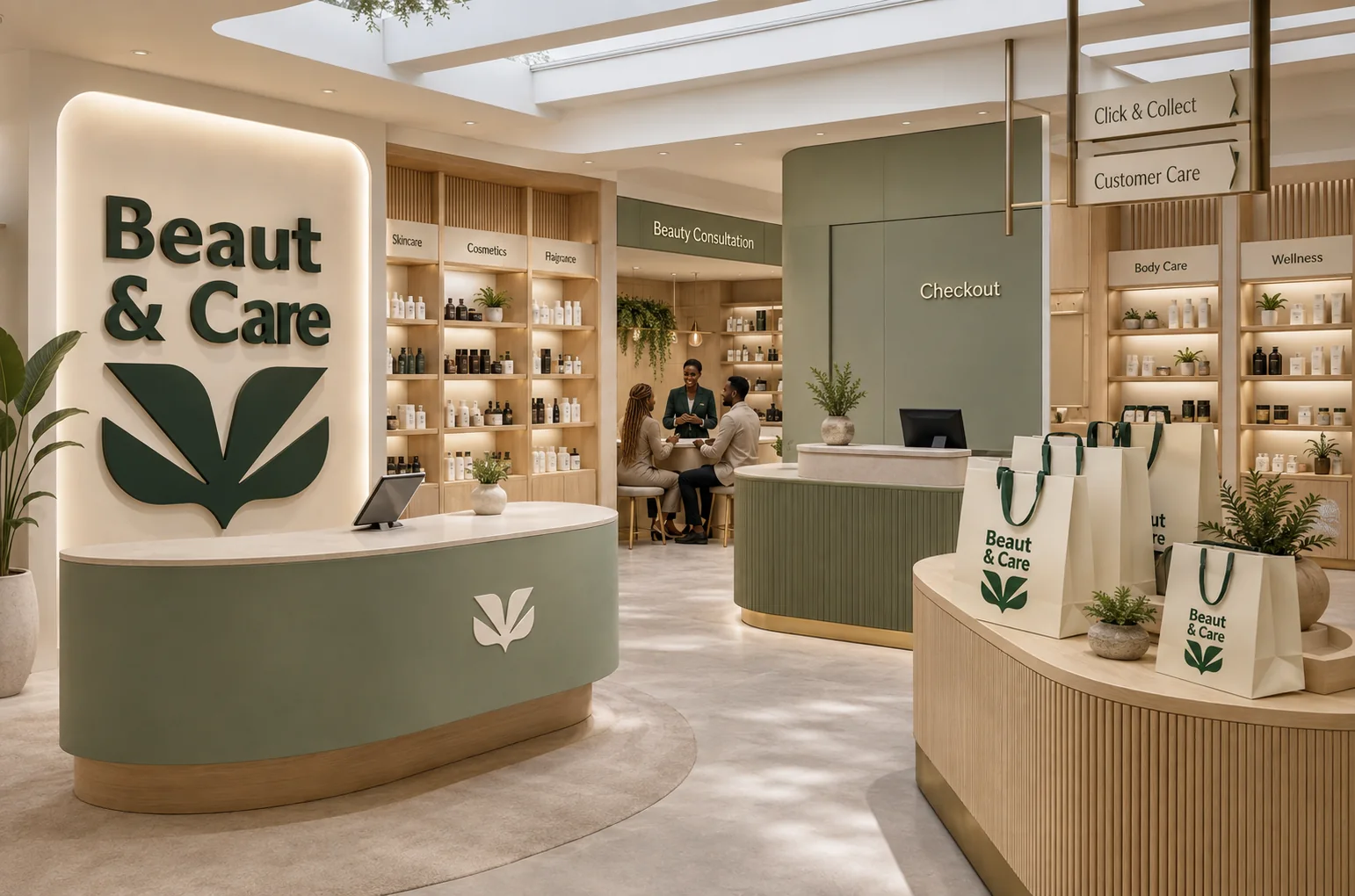
The system draws its confidence from softness, organic form and deliberate restraint. A refined mark, natural green, pale gold and calm typography create a premium atmosphere that remains human and inviting.
A quiet mark with room to grow.
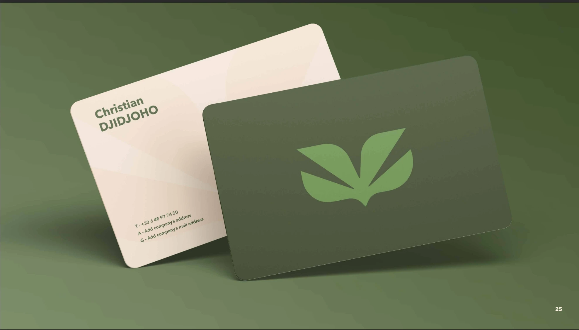
The identity was designed to move comfortably between retail, packaging and campaign moments. Its compact symbol creates recognition at small sizes while the logotype brings a composed, editorial voice to larger expressions.
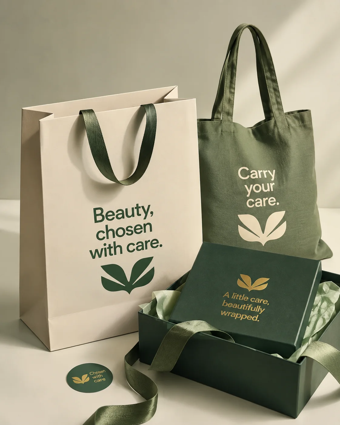
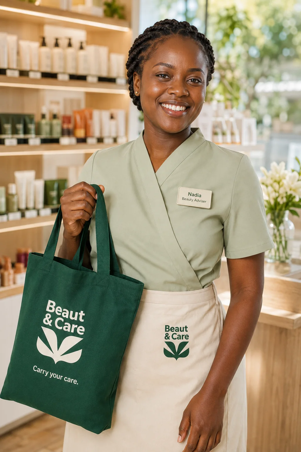
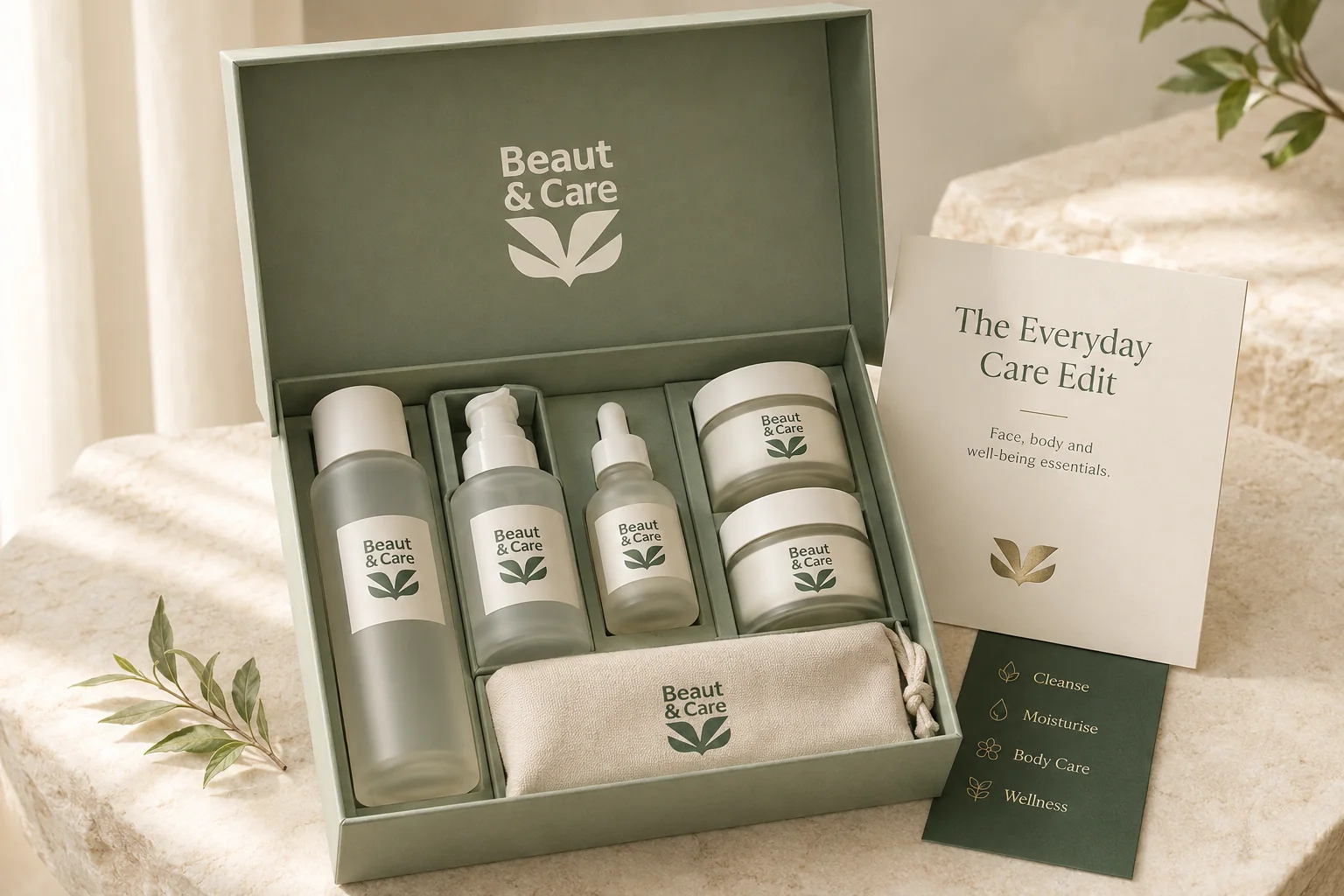
A brand ready to earn trust at a larger scale.
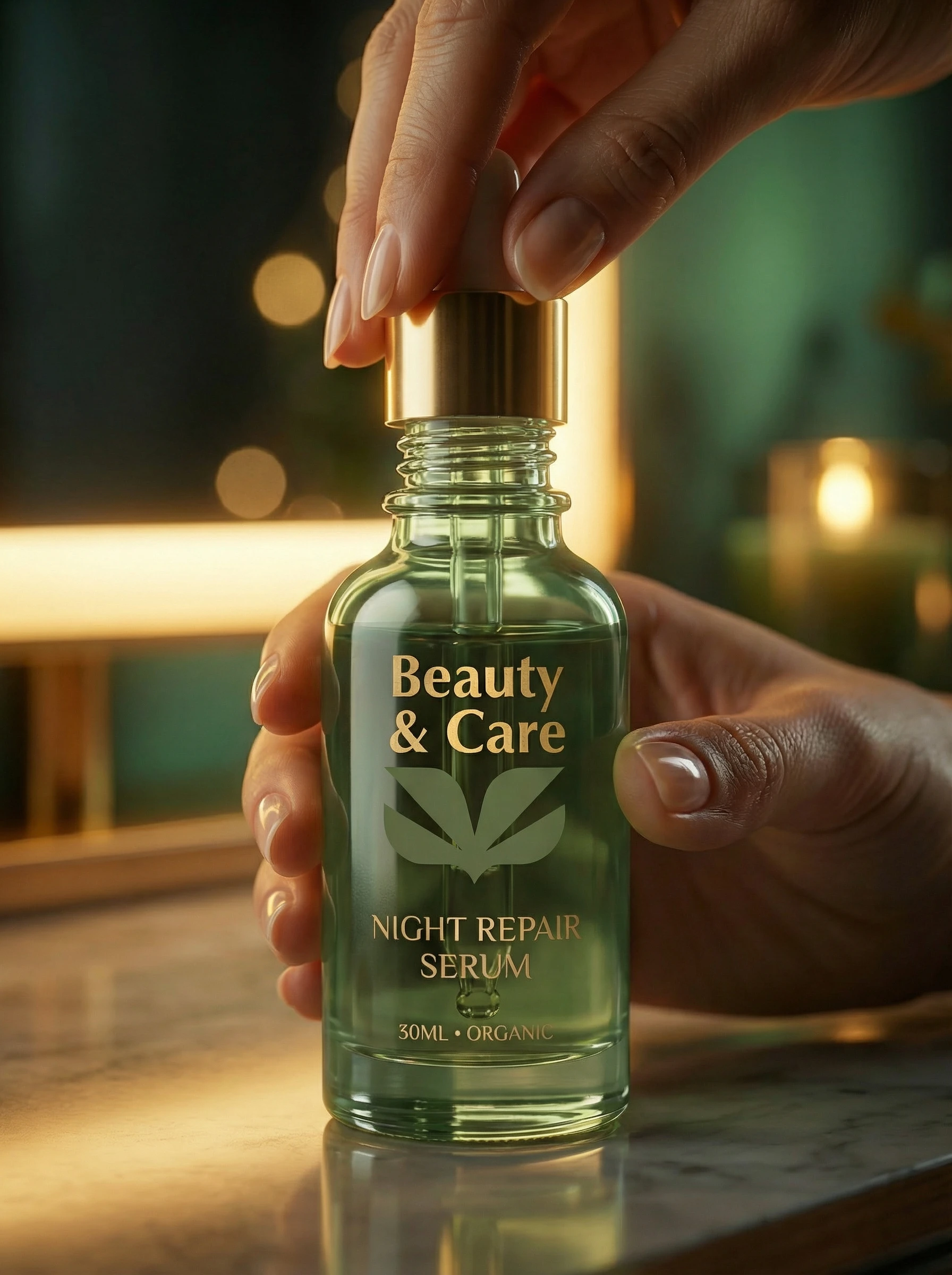
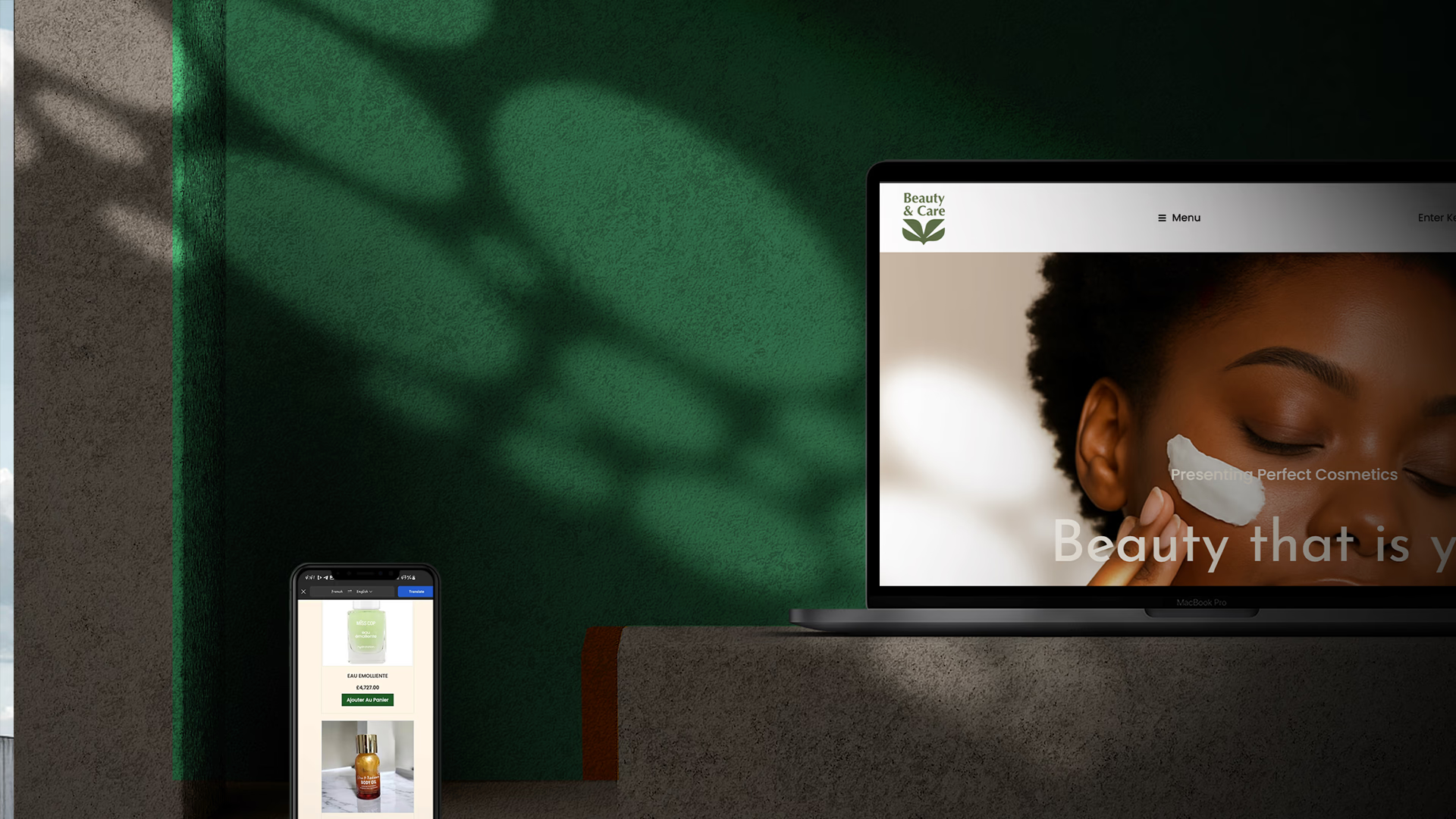
The refreshed identity gives Beauty & Care a consistent platform across retail, packaging, digital and campaign communication. It expresses higher perceived quality without losing the warmth and accessibility central to the customer experience.
- One recognisable system across customer touchpoints
- Motion language developed for digital storytelling
- Retail expression prepared for continued expansion